

Every organization runs into a moment where something feels “off” long before anything actually breaks. Maybe it’s a bank noticing loan r
epayments slipping, or a hospital watching wait times creep upward. That early gut feeling has a formal name in risk management, and it isn’t luck — it’s a risk indicator doing exactly what it was built to do.
If you’re a student trying to make sense of risk management, internal audit, or business analytics coursework, this guide walks through what this concept actually means, the different types you’ll come across, and how real organizations use them to stay ahead of trouble instead of cleaning up after it.
What Is a Risk Indicator?
When you get rid of the jargon, it’s simply a measurable sign that something in a process, system, or environment is beginning to move toward trouble. It might be a number, a trend, or a recurring pattern that signals to decision-makers “pay attention here” before a small issue turns into a full-blown crisis.
Organizations use these signals in the overall context of an enterprise risk management (ERM) framework. A KRI is a metric that uses a model or formula to estimate the probability of degradation of a resource and is meant to indicate when an organization is approaching the limits of its accepted risk appetite.
Think of it like the fuel gauge in a car. The gauge itself isn’t the danger — running out of petrol on a highway is. The gauge is simply the early warning sign that tells you to act before real damage happens.
Students often confuse this concept with plain key indicators of performance. They’re related, but not identical, and mixing them up is one of the most common mistakes in this subject.
KRI vs. KPI: Don’t Mix Them Up
This is the single most common confusion in any risk management classroom. A Key Performance Indicator (KPI) tells you how well something is going. A risk indicator—often shortened to KRI—tells you what could go wrong.
According to Thomson Reuters’ overview of KRIs, KPIs generally track outcomes and objectives, while KRIs specifically monitor potential threats and vulnerabilities that could derail those same objectives. One measures success. The other measures danger, and both matter for a complete picture.
Here’s a simple way to remember it: performance metrics answer “how are we doing?” while a KRI answers “what should we be worried about?” A finance team might report record quarterly revenue (a KPI) while simultaneously watching a rising customer-concentration ratio (a KRI) that could wreck next year’s numbers if one big client walks away.
Why Do These Signals Matter So Much?
Companies lose money, reputation, and sometimes entire business lines every year because a warning sign was sitting quietly in their data and nobody noticed it in time. Closing that gap is the entire point of tracking these signals.
Good indicators support three things at once:
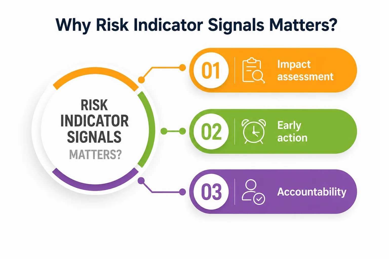
- Impact assessment — understanding how severe a potential issue could get if it isn’t addressed in time.
- Early action — giving teams a window to respond before losses pile up.
- Accountability—creating a documented trail that shows who was warned and when.
When these signals are tracked properly, they turn vague anxiety about “what might go wrong” into structured, testable performance metrics that leadership can actually act on. Skip this step, and most impact assessment work only happens after the damage is already done, which defeats the entire purpose of having a risk function in the first place.
There’s also a communication benefit that often gets overlooked. A board member or a client rarely wants a raw spreadsheet full of numbers; they want to know, in plain terms, whether the organization is safe.
A well-designed dashboard of indicators translates messy underlying data into a story that non-specialists can actually follow and question, which builds trust between technical teams and the people making final decisions.
Types of Risk Indicators
Not every indicator functions the same way. Depending on the industry, the specific risk being tracked, and the timing of the signal, they generally fall into a few broad categories.
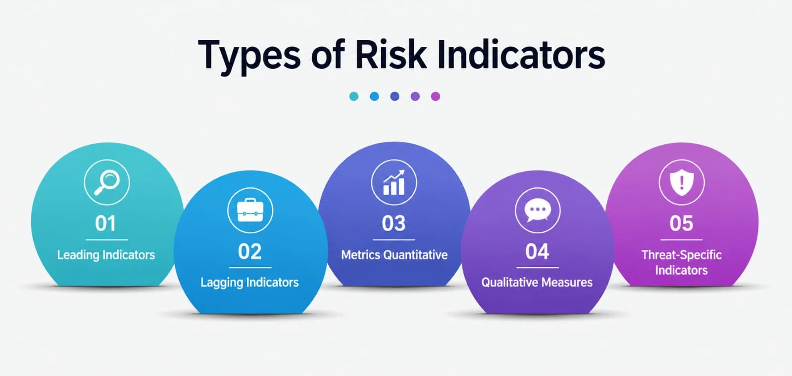
1. Leading Indicators
These are forward-looking. They try to catch a problem before it actually happens. Based on research from Simple But Needed’s guide to leading and lagging indicators, leading indicators include things like near-miss reports, control-testing results, and how often a system receives security patches.
2. Lagging Indicators
These look backward. A lagging indicator confirms that something has already happened — a compliance breach, a workplace accident, a system outage, or a set of unfavorable audit findings. They don’t prevent damage, but they validate whether existing controls actually worked, and they build the historical record against which future leading indicators get calibrated.
3. Metrics Quantitative
These are numbers: a percentage, a ratio, a raw count. For example, the proportion of overdue loan repayments in a bank’s portfolio, or the number of failed login attempts on a corporate network in a given week.
4. Qualitative Measures
They are descriptive, not numeric — an auditor’s professional judgment, an employee survey response, or a risk rating assigned during a compliance review. Numbers don’t always tell the full story of culture and intent—this is where qualitative signals come into play.
5. Threat-Specific Indicators
In cybersecurity, these are usually called threat signals. Security teams watch for unusual login patterns, sudden spikes in phishing emails, or abnormal data transfers as early warning signs that a breach might already be underway. Per Bitsight’s research on cyber KRIs, these signals help security leaders quantify risk exposure so remedial action can be triggered quickly, rather than after an incident has already caused real damage.
A Quick Comparison Table
|
Type of Indicator |
Time Orientation | Real Example |
Best Used For |
|---|---|---|---|
|
Leading Indicator |
Forward-looking | Rise in phishing attempts |
Preventing incidents before they occur |
|
Lagging Indicator |
Backward-looking | Confirmed data breaches |
Confirming outcomes and past audit findings |
|
Quantitative Indicator |
Either | Percentage of overdue loans |
Objective, easily comparable tracking |
|
Qualitative Indicator |
Either | Auditor’s risk rating |
Context that raw numbers alone can miss |
|
Threat Signal (Cyber) |
Forward-looking | Unusual network traffic spike |
Detecting active or emerging attacks |
Real-World Examples of Risk Indicators
Theory only goes so far — this is usually where the concept actually clicks.
- Banking and Finance. Banks track a rising percentage of loan defaults as a classic early warning sign. If defaults climb month after month, that’s a lagging signal telling the bank to reassess its lending criteria and tighten the performance metrics used to screen new borrowers.
- Cybersecurity. A sudden spike in failed login attempts, or an unusual volume of outbound data traffic, works as a threat signal for a possible breach in progress. Security teams referenced in Bitsight’s research use exactly these kinds of signals to catch intrusions before sensitive data actually leaves the network.
- Workplace Safety. Construction and manufacturing firms track near-miss reports and safety-training completion rates as leading indicators, alongside injury rates as lagging ones. Both feed into a broader impact assessment of how safe a work site really is, well beyond what a single incident report can show on its own.
- Corporate Audits. Internal auditors flag a recurring pattern in audit findings — say, repeated inventory mismatches across several quarters — as a strong sign that internal controls are weakening. This is a textbook case of a risk indicator doing its job: surfacing a pattern before it turns into a financial restatement or a regulatory penalty.
- Healthcare. Hospitals track rising patient wait times and medication-error rates as key indicators of operational strain, since both tend to predict larger quality-of-care failures if nobody intervenes early.
- Retail and Supply Chains. A logistics team watching supplier delivery delays creep up week over week is looking at an early sign that a bigger stock-out is coming. Retailers pair this with returns-rate trends and vendor payment-cycle data to build a fuller picture of where their supply chain is quietly weakening, long before shelves actually go empty.
How to Build Indicators That Actually Work?
Building a solid indicator program isn’t about tracking as many numbers as possible — that just creates noise. The best risk teams start with three questions: What outcome are we trying to protect? What data actually predicts trouble before it strikes? And who is going to look at this number and act on it?
A few practical steps that risk professionals — and students working through case studies — tend to find useful:
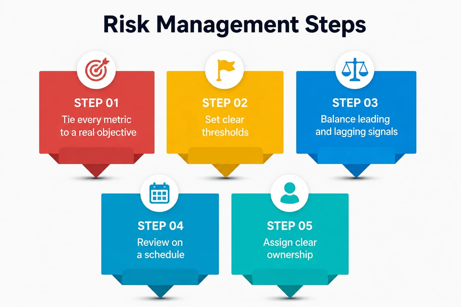
- Tie every metric to a real objective. Random data points aren’t indicators; they’re trivia. A useful signal connects directly to something the organization actually cares about, like customer retention, regulatory compliance, or cash flow.
- Set clear thresholds. An indicator without a defined “red zone” is just a chart nobody reads. Teams need to know exactly when a number moves from acceptable to alarming.
- Balance leading and lagging signals. Relying only on numbers that confirm damage after the fact means you’re always playing catch-up. Pair forward-looking indicators with backward-looking performance metrics so you get both prevention and proof.
- Review on a schedule. Markets shift and technology changes fast, so yesterday’s warning sign may be irrelevant next quarter. A stale indicator does a poor job of catching real trouble, no matter how well it was originally designed.
- Assign clear ownership. If nobody’s job depends on responding to a signal, it eventually gets ignored—however well the metric was designed in the first place.
Common Mistakes Organizations Make
Even well-resourced companies get this wrong, and the same patterns tend to repeat.
- Too many metrics, too little clarity. Tracking fifty numbers sounds thorough, but it usually buries the two or three key indicators that actually matter. Lean, focused programs beat sprawling dashboards almost every time.
- Ignoring qualitative signals. Numbers don’t capture everything. A pattern of employee complaints, or a shift in the tone of internal audit findings, often reveals a cultural or operational problem long before it shows up in the financial statements.
- Treating indicators as a compliance checkbox. Some organizations build indicator dashboards purely to satisfy a regulator, then never actually look at them again until an inspector—or a costly external audit findings report—forces the issue back onto someone’s desk.
- No link between the signal and the action. A threat signal is worthless if nobody has a documented next step for when it fires. This disconnect is one of the most common gaps found during external reviews of a risk program.
A Personal Note
I’ll be honest—the first time I sat through a risk management lecture, “KRI” sounded like one more piece of corporate jargon designed to make simple ideas sound complicated. It wasn’t until I watched a small team ignore a threat signal that looked “too minor to bother with”—and then spend three weeks cleaning up the mess that followed—that the concept actually landed for me.
A risk indicator isn’t about paperwork. It’s about giving yourself, or your team, enough notice to actually do something before the damage is done. If you’re a student reading this before an exam or a case study, that’s the one idea worth holding onto: indicators exist to buy you time, and time is the one thing you can never get back once a risk turns into a loss.