


A Note From the Author
I have spent the better part of six years working inside Agile delivery teams—first as a junior developer who barely glanced at the charts pinned to the board, then as someone who realized, somewhat painfully, that ignoring those charts was exactly why one of our sprints collapsed three days before the deadline. That was the moment I stopped treating Agile project tracking as someone else’s problem and started taking it seriously.
The question I kept hearing from colleagues — especially people new to Scrum — was always the same: “Which chart should I actually be looking at?” The answer is rarely one or the other. But understanding why you are choosing matters enormously. That is what this blog is about.
Did You Know That 71% of Scrum Teams Still Struggle to Pick the Right Agile Chart?
According to industry analysis conducted in 2026, approximately 71% of Scrum teams rely on burndown or burn-up charts as part of their sprint monitoring practices—yet many of them report confusion about which one to use and when.
That is a striking number. We are talking about the majority of Scrum teams around the world using tools they do not fully understand. And when a chart is misread — or worse, when the wrong chart is being used entirely — the cost is real. Deadlines get missed. Scope creep goes undetected. Stakeholders lose confidence. So let us fix that. This blog walks you through everything you need to know about the burnup vs. burndown chart—what each one is, how they differ, when to use each, and how teams around the world are using them in 2026. Whether you are a project manager, Scrum Master, product owner, or developer who just got asked to explain these charts in a meeting tomorrow morning, this is written for you.
What Is a Burndown Chart?
If you have ever been in an Agile sprint, there is a good chance you have seen an Agile burndown chart—even if you did not know that is what it was called.
A burndown chart is a straightforward graph that visualizes the amount of work remaining in a project over time. It tracks progress by plotting tasks or story point tracking metrics left to complete across the project’s timeline, helping teams quickly spot trends, predict deadlines, and stay aligned toward goals. The chart has two axes. The horizontal (X) axis represents time — usually days within a sprint. The vertical (Y) axis shows remaining work, typically measured in story points or hours. At the bottom right is where you want to end: zero remaining work, sprint complete. Data from over 5,000 organizations shows that teams using burndown charts achieve 92% on-time sprint completion, compared to just 65% for those who do not—a difference significant enough that it is hard to argue against using some form of visual sprint monitoring.
The Four Most Common Types of Agile Burndown Chart
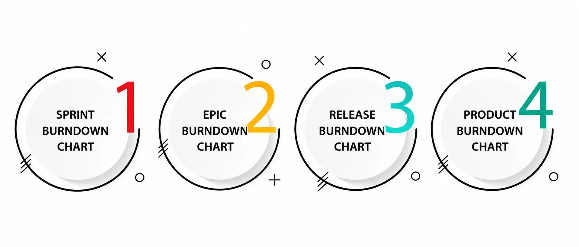
Understanding which version of the Agile Burndown Chart you are working with matters more than most teams realize. There are several types commonly used across Agile projects: the Sprint Burndown Chart tracks work remaining in a single sprint; the Release Burndown Chart measures work left for a larger release; the Epic Burndown Chart visualizes progress on long-term initiatives; and the Product Burndown Chart illustrates the whole project’s workload over the duration of product development. For day-to-day sprint work, the sprint burndown chart is what most teams live by. But here is the thing—the Agile Burndown Chart has a significant blind spot, and it took me an embarrassingly long time to notice it.
What Is a Burnup Chart?
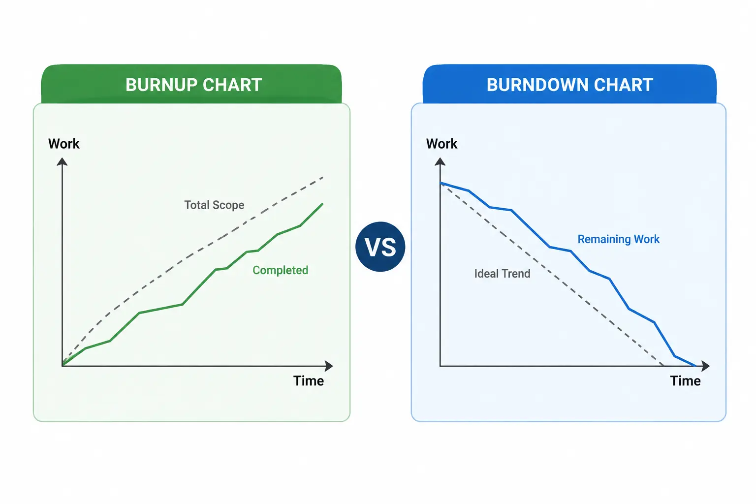
A burnup chart is a roadmap that plots your work on two lines along a vertical axis. One line indicates the entire workload for the project — the total scope. The other depicts the work completed thus far, and at last two lines meet.
That second line is the game-changer. The moment you add a scope line to your chart, everything changes. Now, when a stakeholder walks into a sprint review and says, “Can we just add these three features?” you show them exactly what that request does. The total scope line steps upward. The gap between completion and target widens. No arguments needed; the chart makes the case for you. On a burndown chart, you are watching points disappear. On a burnup chart, you are watching points accumulate — and you can see the ceiling move if the scope shifts. Both methods track story points, but they tell entirely different stories from that data.
Burnup vs Burndown Chart: The Core Differences Explained
This is the question every Agile practitioner eventually asks. Let me give you the honest, no-jargon answer.
In simple English: the burnup vs. burndown chart debate comes down to what question you are trying to answer.
- The Agile Burndown Chart answers, “How much work do we still have left?”
- The Agile burnup chart answers: “How much have we done, and has the target moved?”
If you are only using burndown charts, you are completely blind to scope creep until the sprint fails. The burnup vs burndown chart debate has one important winner for fixed-date projects with changing requirements: burnup charts visually separate scope increases from work completed, making what is actually happening impossible to ignore.
One thing I noticed on my own team: we had a sprint where the burndown looked perfect — steady, clean, heading toward zero. But what it was not showing us was that our product owner had added twelve new story points over three days. The burndown looked fine because we were completing work at the same rate as it was being added. We found out the full picture only when someone finally drew up a burnup chart. That one visual stopped what could have been a very awkward sprint review conversation from becoming a very awkward sprint review conversation.
Side-by-Side Comparison: Burnup vs Burndown Chart
|
Feature |
Agile Burndown Chart |
Agile Burnup Chart |
|
What it tracks |
Remaining work |
Completed work + total scope |
|
Direction |
The line goes down toward zero |
The line rises toward scope ceiling |
|
Scope change visibility |
Hidden scope creep is invisible |
Visible—separate scope line shows changes |
|
Best use case |
Fixed-scope sprints |
Projects with evolving requirements |
|
Story Point Tracking |
Decreasing count of remaining points |
Increasing count of completed points |
|
Complexity |
Simpler to read at a glance |
Slightly more complex, more informative |
|
Sprint monitoring |
Excellent for daily standup use |
Better for stakeholder reporting |
|
Agile project tracking |
Sprint-level focus |
Release and long-term planning |
|
Scope creep detection |
Poor—masked by a flat line |
Strong — visually explicit |
|
Recommended for |
Scrum sprints, fixed deadlines | Releases, evolving backlogs |
When to Use Which Chart: A Practical Decision Framework?
I get asked this in workshops all the time. The honest answer is context is everything. Here is how I think about it.
1. Use an Agile Burndown Chart When…
Burndown charts shine with a fixed scope in projects. If your project has a clear goal, then a burndown chart is your best bet. If you are running a two-week sprint where the scope is locked, the team is experienced, and you just need a quick daily signal during standups, the Agile Burndown Chart is clean, simple, and effective.
2. Use an Agile Burnup Chart When…
Use burnup charts when the scope changes frequently. A study covering 1,200 projects found that by 2026, 82% of Fortune 500 tech firms rely on release-level burndowns to plan beyond individual sprints because this approach predicted project completion with 88% precision—even when scope changed.
3. Use Both for Maximum Agile Project Tracking Visibility
Burndown charts work best when they are part of the rhythm of delivery, especially in a Scrum project, while burnup charts provide a longer-term view that protects against strategic surprises.
This is honestly what I now recommend to every team I work with. Switch to the burnup vs. burndown chart comparison view when you are preparing for sprint reviews or stakeholder presentations.
Real-World Examples of Burnup vs Burndown Chart Usage
Burnup and burndown charts may seem similar, but they often tell very different stories in real projects. The following examples show how each chart helps Agile teams uncover progress, identify risks, and make better decisions during a sprint or release cycle.
Example 1 — The Sprint That Looked Fine Until It Was Not (Burndown Chart)
A software team in a mid-size SaaS company runs a standard two-week sprint with 80 story points. Their agile burndown chart shows a steady, near-ideal slope throughout week one. By day eight, they have 30 points remaining — right on track. The team is actually working faster than the original plan, but the burndown makes it look like normal velocity. They only discover the situation when story point tracking is reviewed manually in the retrospective.
Lesson: the burndown chart hid the problem. A burnup chart would have shown the scope line jumping upward, prompting a conversation days earlier.
Example 2 — A Release That Stayed Honest (Burnup Chart)
A large financial-services company used Agile project tracking through burndown charts supported by retrospectives and leadership — building visibility and trust in delivery progress. Another team’s burndown chart looked perfect but hid scope creep and late testing, masking poor delivery behind a smooth trend line.
The teams that switched to Agile burnup chart views for their releases were able to show stakeholders—in a single visual—that what appeared to be a delay was actually the result of mid-sprint additions. The chart made the conversation easy.
Benefits of Each Chart Type
Both Agile burnup and burndown charts offer valuable insights into project progress, but each serves a different purpose. Understanding the unique benefits of these charts helps teams choose the right visualization method to improve planning, tracking, and decision-making throughout the project lifecycle.
Benefits of the Agile Burndown Chart
- Transparency: Burndown charts enhance transparency by clearly comparing planned and actual progress.
- Motivation: They encourage team members to perform better by showing progress and providing performance feedback.
- Collaboration: They promote effective collaboration by keeping everyone on the same page regarding project status and goals.
- Estimation: They help estimate when work will be completed based on current progress and trends.
Benefits of the Agile Burnup Chart
The Agile burnup chart clearly indicates progress at a glance; it shows both total work and work completed. It facilitates forecasting by allowing your team to determine an approximate completion date. It highlights scope changes and manages scope creep explicitly—unlike a burndown chart. And it permits early detection of issues before they become massive headaches.
Conclusion
After years of working inside Agile teams and watching both charts do their job—and fail at it—here is what I know for certain: the burnup vs. burndown chart is not a competition. They are two tools built for two different questions.
The Agile Burndown Chart is your daily driver. It is fast, simple, and ideal for sprint monitoring inside a fixed-scope sprint. The Agile burnup chart is your strategic view — the one you want for releases, stakeholder conversations, and any project where scope changes are a real possibility (which, honestly, is most of them). The goal of Agile project tracking has never been to pick the prettiest chart. It has been on the surface, the truth fast enough to do something about it. Understanding the nuances of the burnup vs. burndown chart debate is the difference between leading a predictable engineering organization and constantly fighting fires.
So, pick the right tool for the right question, update it daily, and let it do what it was designed to do—tell the truth about your sprint before the sprint ends and it is too late to act.